LAWA has engaged Webcor–Gensler to deliver design-build wayfinding upgrades across LAX’s 3.8-million-square-foot campus in preparation for the 2028 Olympics. The scope includes enhancements to both static and digital signage, implemented in phases across all terminals, parking garages, APM stations, and the airfield. The Wayfinding Enhancement Program also encompasses a comprehensive update to LAWA’s Wayfinding Standards, aligned with a full terminal and gate renumbering initiative to establish consistent, airport-wide naming and numbering in support of a world-class passenger experience.
According to Webcor Sr. Design Manager Aileen Santos-Redman, the signage at LAX has relied on a hodgepodge collection of Helvetica – including some "fake" versions that have crept into the system over the years – for decades. While Helvetica is a workhorse of the design world, it lacks a certain soul. As part of a broader effort to bring "LA" back into LAX, the project team realized that a world-class gateway deserves its own distinct voice.
It’s easy to think a font is just a decorative choice. In a high-stress environment like an international airport, wayfinding is a critical utility. The fact is, the old signage wasn't cutting it.
“The goal was to create something that felt authentically Los Angeles while solving some major legibility issues,” says April Chang, project manager who was on the team when the initiative first took flight.
The team partnered with Dalton Maag, a renowned typeface design studio in London, to develop a unique LAX wayfinding font.
How do you distill the essence of Los Angeles into a set of characters? You look at history. The designers drew inspiration from iconic local landmarks, including the Beverly Hills Hotel's typography.
The font design has been more than just a design exercise; it's a call for better functional aesthetics in our public infrastructure.
The fonts will also apply to maps, which will be tested for the effectiveness of elements such as “You are here,” doors and gates, route lines, and more.
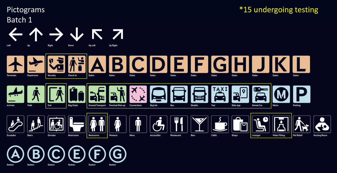
“The whole experience has been enlightening,” Aileen says. “As a traveler, I know signage is something I count on, and I have been critical of wayfinding systems that don’t work well. But getting involved with this was eye-opening in terms of the many elements of font design that I’ve never even thought of.” That includes the colors – which have to work well with the font in both light and dark modes – and associated pictograms (those symbols you see that designate restrooms, taxi stands, bars, and other amenities). Colors must also work well for passengers and employees with color vision impairments.
Aileen is now focused on the practical application of this new tool. While the official name of the font remains under wraps, it is a specialized derivative of the benchmark Interface font, designed for the unique distances and lighting requirements of an airport terminal.
The rollout is a massive undertaking. “We are not just talking about a few signs,” Aileen says. “We’re talking about a systemic update to maps, digital displays, terminal and gate signage, and other physical wayfinding across the entire LAX campus.” This requires ongoing dialogue between builders and design teams to ensure the physical structures accommodate the new visual language.
For example, comprehension studies were conducted among LAX travelers and employees to assess the effectiveness of the proposed pictograms.
The wayfinding project reminds us that every detail matters in the employee and traveler experience. Webcor is helping to build more than just walls and gates; we are building the first impression millions of people have when they land in California.
The move from "off-the-shelf" Helvetica to a bespoke LAX font is a significant shift in how the airport communicates with its passengers and staff. It turns a functional necessity into a branded experience that tells people exactly where they are—Los Angeles—while also tying the LAX campus together as a whole.